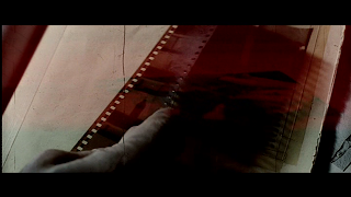
A choice favourite of mine, director David Fincher (Fight Club, Zodiac) presents us with a gripping story following a murder case revolving around the Seven Deadly Sins, and visually, I feel this film can send a shiver up one's spine with its tonal choices, cinematography, and most intriguingly - the opening and closing credits! I'll begin with a few screenies of them:


The still images don't quite fully do them justice, though the haphazard composition of both should give an idea of the unpredictable 'film-juddery' motion exhibited. The opening credits is a jumpy montage of the killer's preparations as we see him (or her) snipping bits of text and photographs up, writing things in a packed notebook, developing photos and so on. Images of these various actions are luma-matted onto one another for one or two frames at various intervals, with uneasy film-judder prevailent throughout. It paints a vivid and unsettling backdrop for the rest of the film to come...
Speaking of which, it was only made apparent to me only on last weekend's watch of the stark choice of tone during the case investigation versus the penultimate scene where the killer has been apprehended. An example of a typical outdoor shot in the midst of the investigation:

Not only is it consistently pouring down throughout the investigation, the tone further reflects this, even indoors with a cooler, fairly desaturated palette. It projects a sense of foreboding over the impending murders and how it will all wrap up in the end - as Morgan Freeman's character William Somerset plainly states to his partner, "This isn't going to have a happy ending."
Furthermore, here we have the result within the last ten minutes of the film:

Phew, hop out of the cold shower and into the sauna, things are quite the opposite temperature wise in the tense finale. The rain has stopped and the setting sun beats down as the journey draws to a close and a critical revelation is made. The stark difference between the two palettes only serves to create further unrest as things are wrapped up. And then, credits:

Very sad, but I think this is awesome - the credits travel downwards, which is really creepy I feel... I've never seen that before. Like the opening credits, the visuals are gnawed and gritty, composed of off-cuts of the killer's prep work, interspersed amongst the text throughout. I love how the film insists on maintaining its atmosphere, even as the majority of the audience are leaving the cinema, something that I feel would be imperative to keep a tight reign on - no stone left unturned.
When all's watched and done, this film really reminded me of its relevance to informing my own work, and so, that's another one to consider in NMTB's visual repertoire. Character designs for Dr. Wright, Mrs Wright, and twisted surgeon Nancy Heart coming up.


.gif)

1 comment:
clever connection my friend, seven is actually my seventh favourite film (will send you a top ten soon). and the style of seven during the schizophrenic credits and title sequence could be a great contribution of your design. however i might make the point that having this style would intice more horror than grotesque comedy. just a thought, looking more for ren twitchy monologue, not pig rape :)
Post a Comment