25.12.08

Dr. Wright... Uh-gain!


I'm feeling better now, as if real progress has been made. A selection of rough development stuff above... looks as though I was drawing heavily upon early Hanna-Barbera there. And below, what you see I still wouldn't consider quite final, as I still want to mull it over and sketch ol' Wrighty a little more to see how he can be handled in 3D space and how rapidly I can bash out a drawing. Anyhew, feast away.


And Merry Christmas one and all - here's to hoping that you all have the hap-hap-happiest Christmas since Bing Crosby tap danced with Danny fuckin' Kaye.

Advanced Reading and Purdy Pictures

I was milling around the internet the other day and fell into an all-too-familar time-sapping trance, specific to internet surfing - what I like to call 'The Wikipedia Effect'*. Bouncing from one hyperlink to the next I came across a few artists/works that warranted a sly right-click/'save as' proceedure and thus, I present to you some artwork that has helped me to further develop the aesthetic of my character designs [most notably Dr. Wright's] and also given me food for thought regarding inspiration for the overall, final aesthetic.

Firstly, Dr. Seuss' book Gerald Mc Boing Boing (1950) with illustrations by Mel Crawford [he's also illustrated alot of Hanna-Barbera-based books incidentally]. I've been toying with the notion of creating a 2D animation without any outlines, promoting simple, yet strong chracter design, partially for the challenge, though I don't know how workable it'll be. I don't know whether Genndy Tartakovsky [Samurai Jack, Dexter's Laboratory] was at all inspired by work such as Crawford's, but it does remind me of him somewhat.


Next, a shot from UPA's Academy Award winning short (1951) of the book which carries a similar aesthetic [though the characters do have outlines.] What I'm more concerned with here however, is the stark simplicity of the layouts. Superb three-dimensionality and the sad mood of the scene is achieved through bold, basic tonal blocks and minimal line.


Finally, the front cover of the second [and final] issue of Dell Comic's Kookie (1962), created by John Stanley. Similar stuff going on here, albeit with more tonal detal and a rougher overall texture to the piece.


And there we have it, the so-called food for thought, some of which I have been putting into practice along with what else has been picked up along the way so far. Next up, more Dr. Wright designs.


*Not specific to using only Wikipedia, but the whole interweb. This and many other unique and useful phrases can be found in The Oxford English Dictionary of Fryisms.
Available in 2009 from all good book retailers.

To The Dumping Ground... A Prospective Shot

With a proper title that doesn't infringe on record-related copyrights [probably] and a character design for Dr. Wright that is fast headed for 'final', the old blog header has been relegated to The Dumping Ground for those interested in the relics of this project as a new header solidifies my intentions further.

Oh, and of course, the work that went into the old header served a dual purpose. It's an illustration of the penultimate shot of the film where Mrs. Wright gets an unwarranted surprise as her husband's mutilated genitals are revealed to her in their full glory. So here it is, as if I'd reached into the future with all my might and dragged a high-definition screenshot of the film back into this blog for full scrutiny of all its errors and short-comings.


Lions, your feast is piping hot... well... microwaved to buggery.

17.12.08

A Potential Title

For those who weren't already aware, Never Mind The Bollocks is a 'working title', meaning that it is subject to change. It was one of those epiphany moments when I woke up this morning that I could feel a new title stirring in my mind.

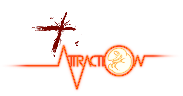
The result? Natal Attraction. Don't ask me where it came from, but it was just there. I'll mull it over and we'll see, but personally, I'm liking the sound of it. And whilst we're on the subject - obviously its a pun on the Michael Douglas/Glenn Close flick Fatal Attraction (1987), and out of curiousity I looked up some of the theatrical posters and came across this one... well, it's the main one:


For those few of you who still remember my recent animatic and haven't gone into therapy, it appears I've
inadvertently referenced this [seemingly by fluke, as I don't recall this poster/cover] in one of the final shots as Dr. Wright's tackle 'rips' in two. Oh well, nice accidental homage. Maybe I should reference more heavily from here on in.

So, any thoughts or comments on the new title, let me know. Got a pithy title suggestion? Jot it down and I'd be more than happy to have a gander.

9.12.08

Nancy Heart... Sexy Clichés Galore

Again, this should've been posted about four weeks back, but it slipped my mind. A few designs of the villain, Nancy Heart at two stages. Here's the begining stages of Nancy:


And moving on a week or two, some more sketches of Nancy. Yes, people are undoubtedly going to draw comparisons to Jessica Rabbit. It wasn't my intention to create a 'knock-off' character, but then again Jessica Rabbit is a walking set of clichés herself, and likewise I'm creating a similarly sexy and dark character here, so this is somewhat unavoidable. Funny thing I noticed as I was drawing however is that her hair shape resembles the head of a shark slightly... So I'm going to play on that factor - she's on the hunt for her prey after all.


So, that leaves only Mrs. Wright (whom, incidentally, is the one in the banner at the top of the blog). I'll have some designs for her up real soon, along with the second pass animatic. Good times.

'Lovely Women'... Eighties Minges


Courtesy of Rob V's other half Charley, I have here a few sketches from an issue of DRAW! which includes the first part of Bret Blevin's How To Draw Lovely Women. I should've put this up a while ago as I've had these photocopies pinned to my wall for a while now (research purposes only!) and of course, they're highly relevant to the development of the characters of both Nancy Heart and Mrs. Wright.


That said, having designed proportionally more male characters in my time, I've found it remarkably easy produce some female character designs that I'm at least moderately satisfied with - far less of a struggle than what Dr. Wright has been.


So please, do enjoy these well-e
xecuted sketches of Mr. Blevins' - he's certainly got an eye for good female form.